
The app solved reporting for people on the ground. But Instituto Cerrados also needed a way for administrators to see the whole picture: how many territories were registered, how many incidents were coming in, and whether conservation actions were actually happening.
This is a different audience with a different job to do. Field users need speed. Administrators need a clear, trustworthy overview to support decisions, funding conversations, and reporting to partners. Designing both from the same visual system without treating them as the same problem was the real work.
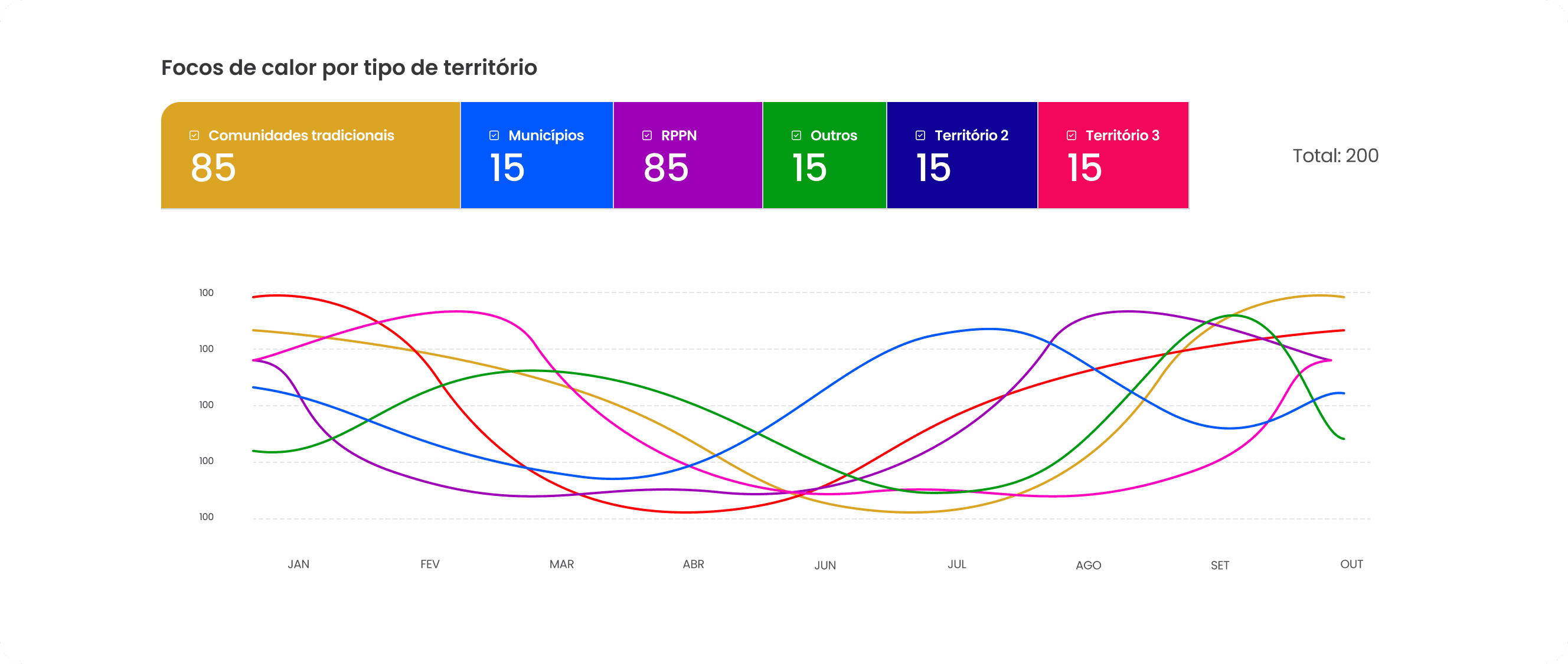
I designed a dashboard that consolidates protected territories, real-time heat source detections, total engaged users, and implemented mitigation actions into a single administrative view. The goal was to turn raw monitoring data into something a non-technical program lead could read at a glance and act on, not a data dump that required a technical translator.
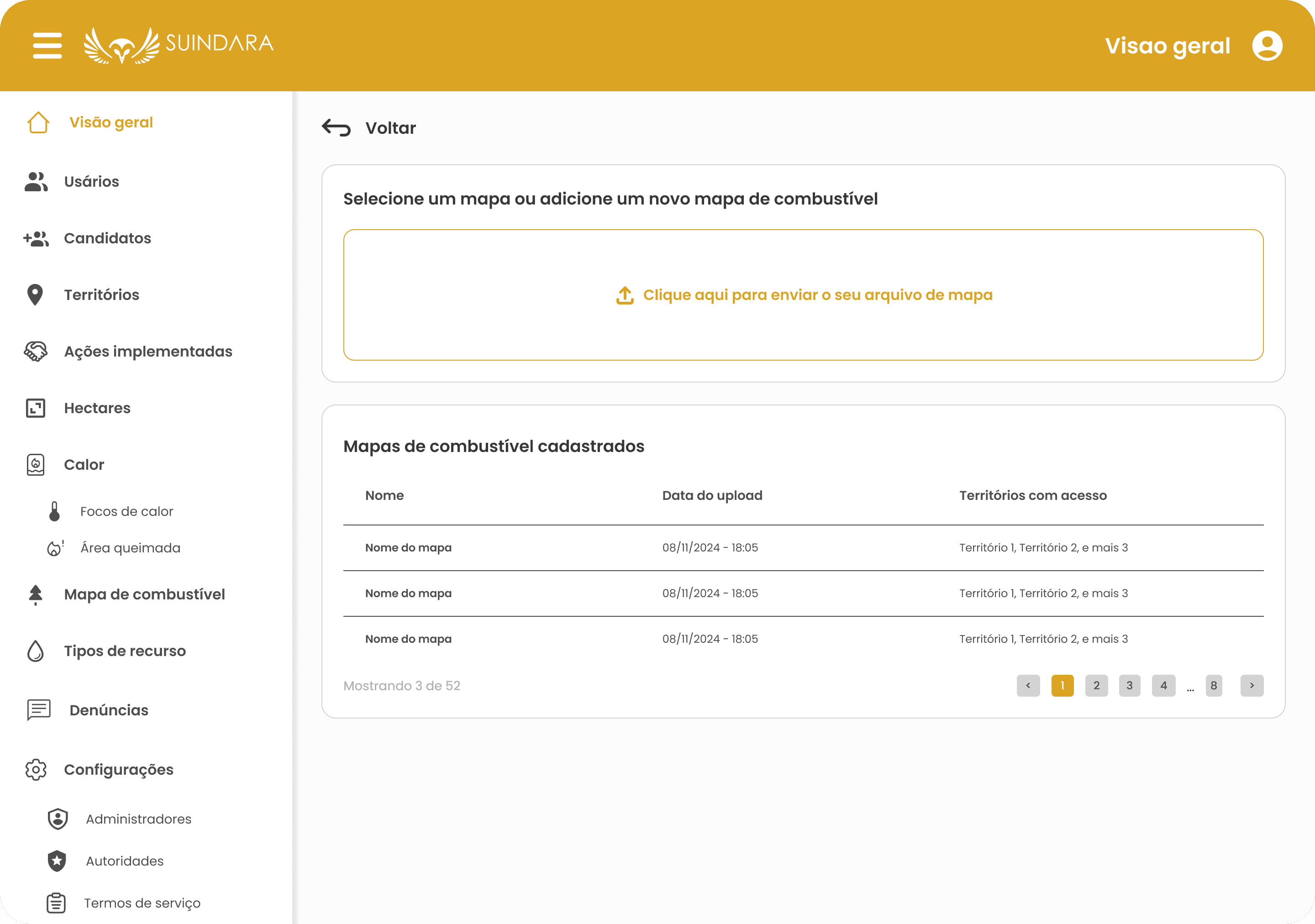
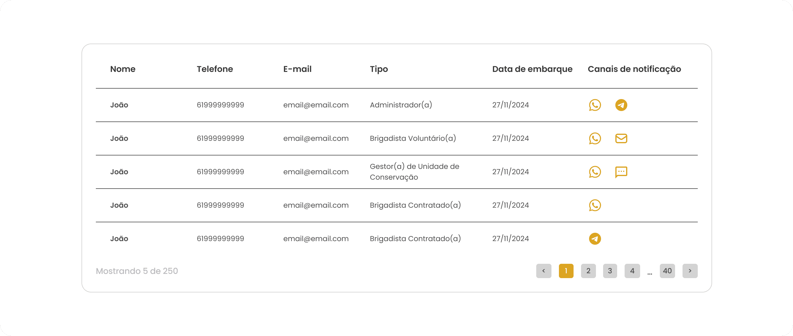
Administrators now have a live, centralized view of conservation activity across the program, supporting faster response and clearer reporting on impact over time.
Tools: Figma, dashboard design, data visualization